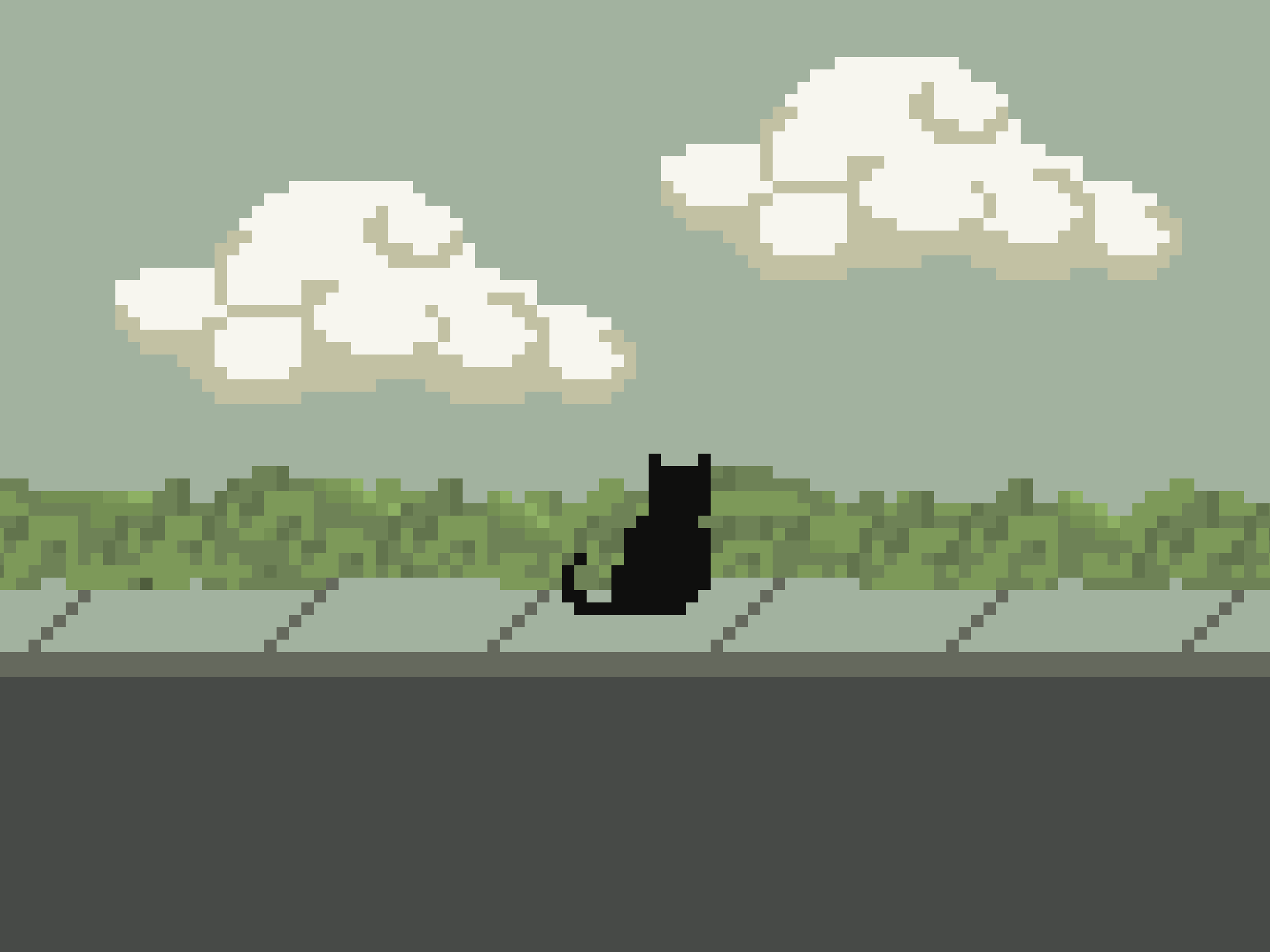
Portfolio Website 2024
Introduction
I’ve always wanted to have a portfolio website, and now I’ve finally brought it to life. The best part? Complete freedom to do what feels just right. This website isn’t just a portfolio. It’s my internet home, where I can showcase my work and share what I’m up to.
Conceptual design
I envisioned a space that feels warm, cozy, and personal. Here’s a look at the images from my original mood board.
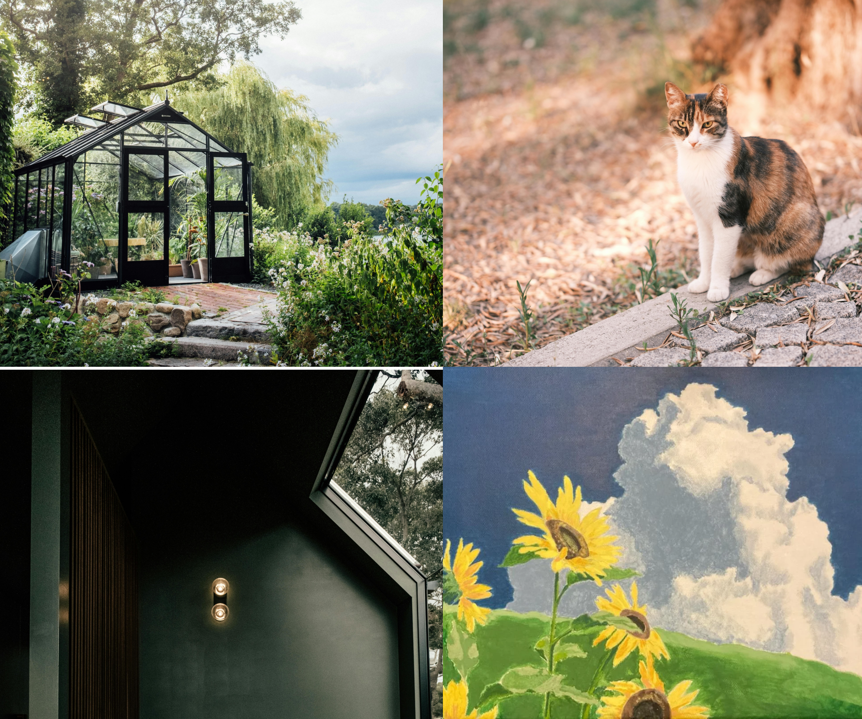 Some images on my mood board
I started with sketches on paper to map out the structure. The website would be straightforward: a homepage for showcasing my recent activities, a work section for hiring managers, and a simple about me section.
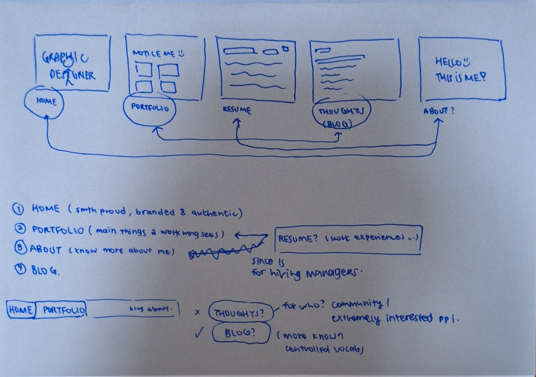 Initial sketches and notes done quickly on paper. I've got a ton of these!
After many more sketches, I was ready to move onto Figma and mock up a page reference. I spent some time experimenting with colors, layouts, and various UI elements. This combination seemed to work for me and I got right down to coding.
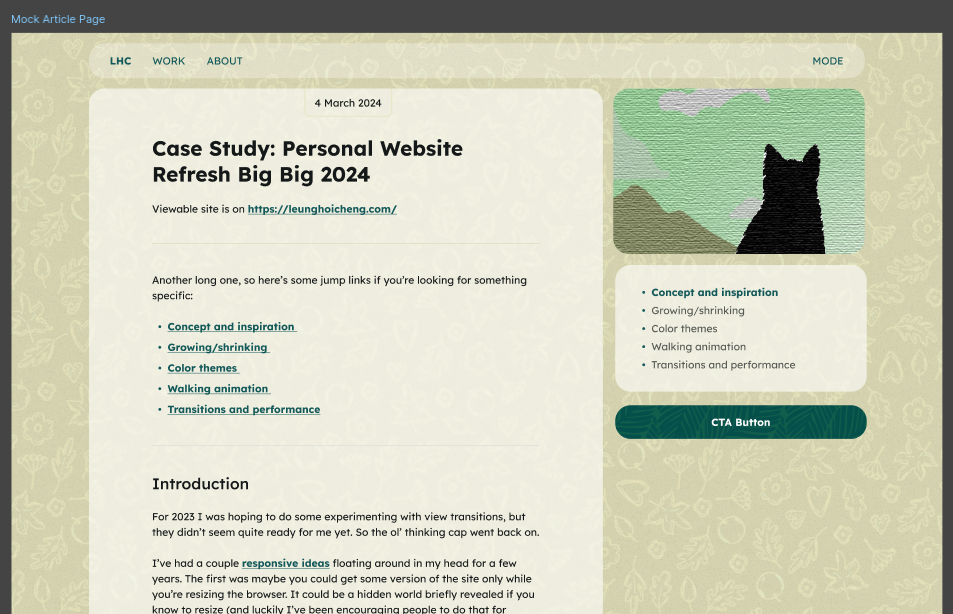 Mock reference of the work entry page in Figma along with some experimental elements
Executing the idea
Building this website from scratch using the skills I gained through The Odin Project (TOP) was a natural step. It allows me to apply what I’ve learned and bring my ideas to life.
I used React with Vite because this is what I’m most comfortable with right now. I set up routing with react-router-dom. A quick look at my configuration:
import React from "react";
import ReactDOM from "react-dom/client";
import { createBrowserRouter, RouterProvider } from "react-router-dom";

import "./styles/global.css";

import HomePage from "./pages/HomePage";
import WorkPage from "./pages/WorkPage";
import AboutPage from "./pages/AboutPage";
import WorkEntryPage from "./pages/WorkEntryPage";

const router = createBrowserRouter([
  { path: "/", element: <HomePage /> },
  { path: "/work", element: <WorkPage /> },
  { path: "work/:slug", element: <WorkEntryPage /> },
  { path: "/about", element: <AboutPage /> },
  { path: "*", element: <h1>Error Page</h1> },
]);

ReactDOM.createRoot(document.getElementById("root")).render(
  <React.StrictMode>
    <RouterProvider router={router} />
  </React.StrictMode>
);
Next, I added some dummy pages and now I have a working base to build my sections on. Let’s keep going.
Work Entry Page
I went with writing my content in markdown because it was easy to write with and saves me from wrestling with HTML every time I wrote a new entry for my website. I thought I could just slap my markdown file into the project and everything would work perfectly. Spoiler alert: it didn’t quite turn out that way.
By default, React doesn't handle .md files on its own, so I added a line that tells Vite to treat markdown files as assets in vite.config.js:
export default defineConfig({
  plugins:
  ...,
  assetsInclude: ["**/*.md"],
});
Next up, to extract front matter metadata like titles and dates from my markdown files, I used a package called gray-matter. This helps me split my front matter and content from a markdown file.
When that was done, I met my next challenge: handling the table of content (TOC). I did not want to hard-code a TOC everytime I wrote a new markdown entry. After some digging, I settled on a set of packages: markdown-it, markdown-it-anchor, and markdown-it-toc-done-right. Here's how they work together:
markdown-itturns markdown into HTML.markdown-it-anchoradds unique ID to headers.markdown-it-toc-done-rightuses these added IDs to create a TOC dynamically.
Here's a snippet which generates a table of content if [[toc]] is included in my markdown. I ran into an issue trying to get just the TOC, so I wrote a function to extract that:
const generateToc = (markdown) => {
  const md = new MarkdownIt({
    html: true,
  })
    .use(anchor, {
      level: [1, 2],
      permalink: false,
    })
    .use(Toc, {
      listType: "ul",
      level: [1, 2],
      containerClass: "toc",
    });

  const contentWithToc = md.render(markdown);
  const tempDiv = document.createElement("div");
  tempDiv.innerHTML = contentWithToc;
  const navElement = tempDiv.querySelector("nav.toc");
  const toc = navElement ? navElement.outerHTML : "";

  return { toc, contentWithToc };
};
And here's how I fetched and processed a markdown entry to get its frontmatter and content:
export const fetchMarkdownEntry = (slug) => {
  return workEntries[slug]()
    .then((module) => fetch(module.default))
    .then((response) => {
      if (!response.ok) {
        throw new Error(`Network response was not ok: ${response.statusText}`);
      }
      return response.text();
    })
    .then((text) => {
      const { content, data } = matter(text);
      const { toc, contentWithToc } = generateToc(content);
      return { contentWithToc, frontMatter: data, toc };
    })
    .catch((error) => {
      console.error(`Error fetching markdown entry for slug "${slug}":`, error);
      return null;
    });
};
Yay, no need to waste time on manual TOC updates. Here's how it looked like when I was experimenting it with test data.
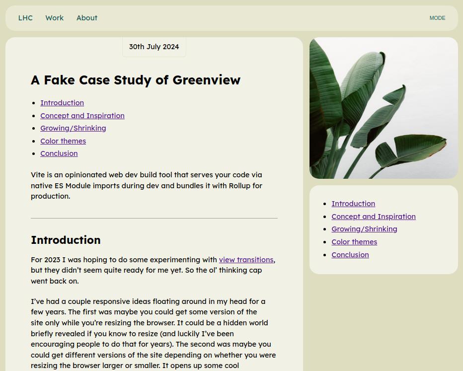 A screenshot of the work entry page in the midst of work in progress
An experiment with sprites
For the homepage, I wanted to add a personal and fun touch, so I threw together some quick pixel art featuring my late family cat. Originally a placeholder, the art grew on me as I continued with the project. In the end, I kept it.
 The animation that is on my front page. The cat’s name is 小白 (Little White).
I explored sprite animations and learned that sprites are basically a sequence of images with some CSS magic to make them move. Initially, I tried scaling the art to fit the div, which involved a lot of fiddling like setting padding-top based on aspect ratio and blending edges with a gradient. It worked largely okay, but had issues like blurriness and an odd behavior of disappearing at the end of each cycle. I wasn’t able to work out some of these issues, so I ended up converting the sprite into a GIF and it worked like a charm.
 The experimental sprite sheet I was working on which has 18 steps
I'd like to explore sprites further, but next time, I plan to use SVG format instead. It seems like a better option for managing scale, which was the biggest challenge I faced with this part of the project.
Mastodon
To showcase an active update of what I’m up to on my homepage, I originally intended to create a Twitter/X account so that I can embed my feed. But given the direction it was going, I wasn’t very keen and started looking for alternatives instead. The concept of the Fediverse appeals to me and I created an account on Mastodon instead. I appreciate having data ownership and being able to curate what I see.
To embed my feed, I found Mastodon Embed Timeline which allowed me to freely customise its CSS. I spent some time here experimenting with the styles, with the end result looking something like this:
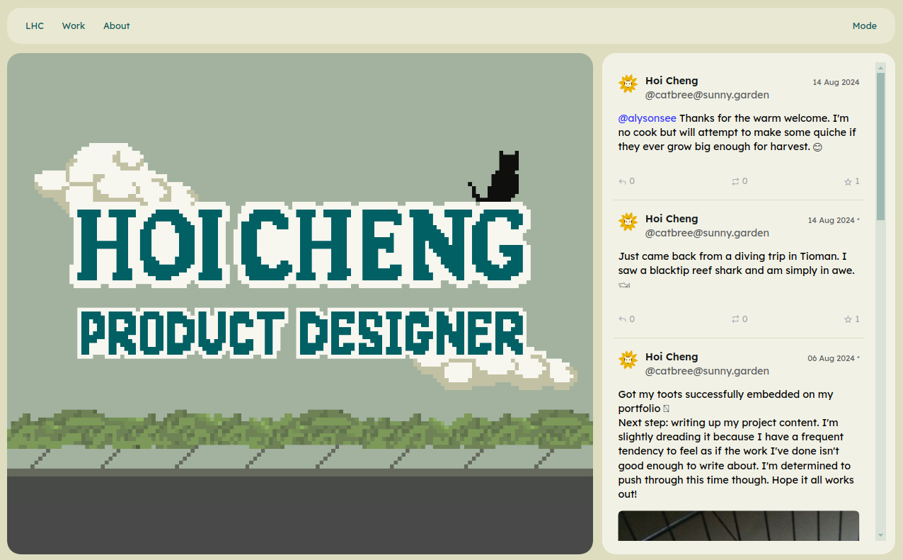 A screenshot of the homepage in the midst of work in progress
Receiving feedback
I decided it was time to gather some feedback. I shared a working link of my site amongst my friends, as well as a shout-out on the @sunny.garden Mastodon server. After reviewing the responses, these were the key insights.
It was reassuring to see that the general impressions aligned with the major themes I aimed for: welcoming, positive, and calming. The hero image on the homepage seems to play a big role in creating that atmosphere.
However, people had mixed feedback on my written work articles. Some found them easy to read and naturally flowing, while others felt that the relaxed format was too loose, offering limited takeaways for hiring managers.
They also highlighted several usability and responsiveness issues. The “LHC” label in the page navigation confused many readers, so I change it to “Home”, which is more universally recognisable. The social feed on the front page also puzzled some readers, as they were unsure of what they were looking at, so I added a header for clarity. Someone pointed out the awkward double scrolling on the homepage when view on mobile, both on the social feed and the page itself. To fix this, I kept the homepage screen height fixed to the mobile viewport so that scrolling only occurs within the social feed.
This comparison shows the before and after of the issues mentioned above and how I addressed them.
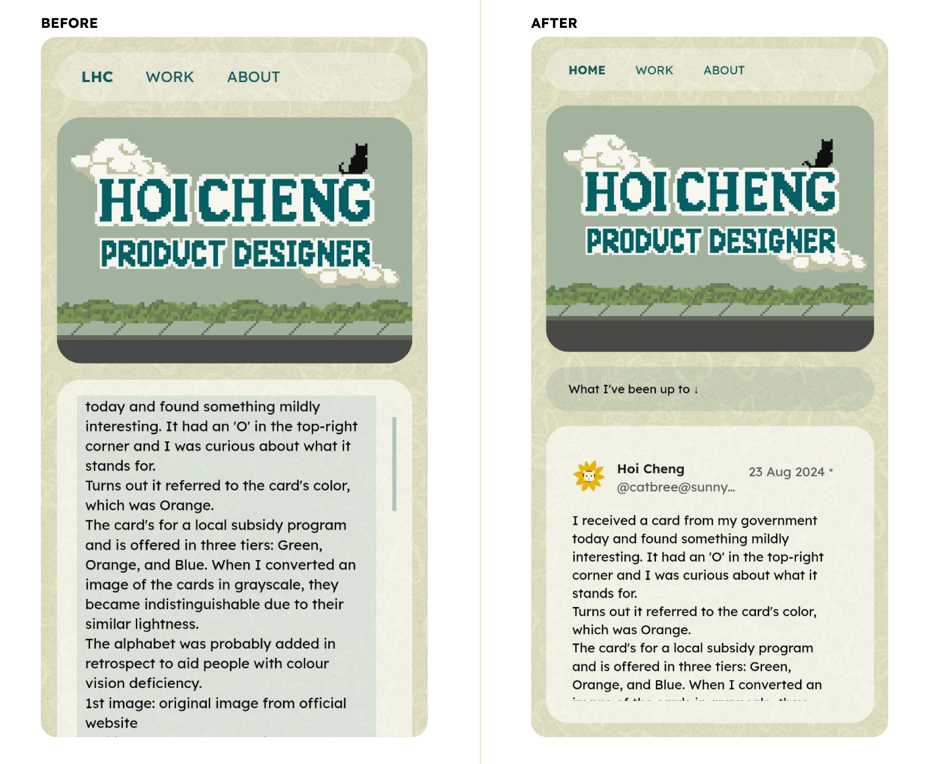 Before and after comparison of the homepage
After addressing the issues, I turned my attention to improving the articles. I’m working on keeping my articles more laid-back but still getting the main points across. This still needs some work.
Conclusion
The website is now mostly complete, and I’m incredibly proud and relieved. There are still some usability issues I haven’t addressed, and I’ve noted them down for the next round of updates. If I kept on working, I’d never get the site launched!
A few things I plan to add (not in order):
- A call-to-action button on the hero image for certain screen sizes where there's more space.
- A zoom function that allows readers to zoom in on images, particularly on mobile.
- A hidden feature, something random and purely for fun, like a hidden music player.
- A table of content, with more interactions to let readers know which part of the article they're on.
- A button that brings readers back to the top of a page.
Before I leave, I want to say a huge thank you to those who helped bring my website to life, with special mentions to:
- @blue, @apparentlyrolly, and @PonderosaJohn from @sunny.garden, for their encouragement and feedback, which gave me the confidence I needed to push the site live.
- Sam, who helped me test my site multiple times and even illustrated her points on how to take the website further.
- Tish and Isaac, for their detailed and constructive feedback, especially on what hiring managers might look for, covering angles I haven't fully considered but should have.
- Steph and Rashmita, for their supportive and positive energy, and for taking time out of their busy days to flag issues.
- And finally, Sebastian, who witnessed nights of me wailing about technical and design issues, and then nights of me zooming around in excitement after I've figured them out. For being my rock.
